Client
Rewizi
Project Details
Brand Strategy, Naming & Logo Design
As work from home became viable after the pandemic, more consumers were on the lookout for an audiovisual setup that seamlessly connected the office and home. Rewizi offered them simplified plug-and-play solutions that integrated the best equipment from global audiovisual brands.

The company approached us to create the brand identity, and we used the ease and efficiency of the offering as the focal point. We conducted interviews with target customers to understand their pain points with regard to WFH. The unanimous answer was that they “miss being in the room”; WFH creates a sense of having missed parts of the discussion or being unable to communicate effectively. This is precisely what Rewizi addresses.
While the technology itself is complex, Rewizi’s expertise makes the experience seamless, so that customers can work from home without missing a word or visual. Through customer research, brand workshops and communication strategy sessions, our core brand idea found common ground between the brand purpose and the objective of all human communication – empowering connections.


Once we established ‘Empowering connections’ as the brand purpose, we took inspiration from the Shona word for ‘river’ for the brand name. As wellsprings of civilization, rivers have connected people and places, enabling culture and commerce to thrive. Today, this is the role of audiovisual technology.

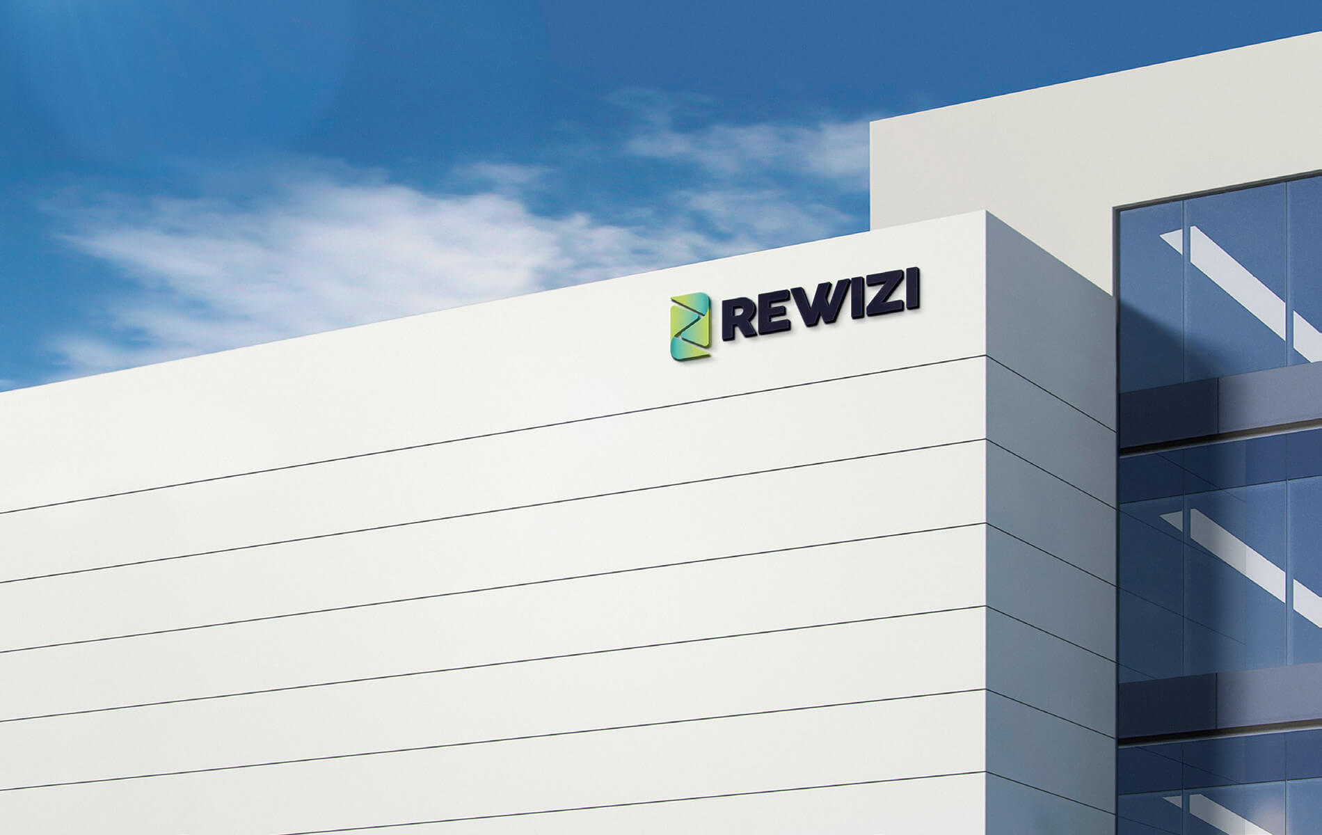
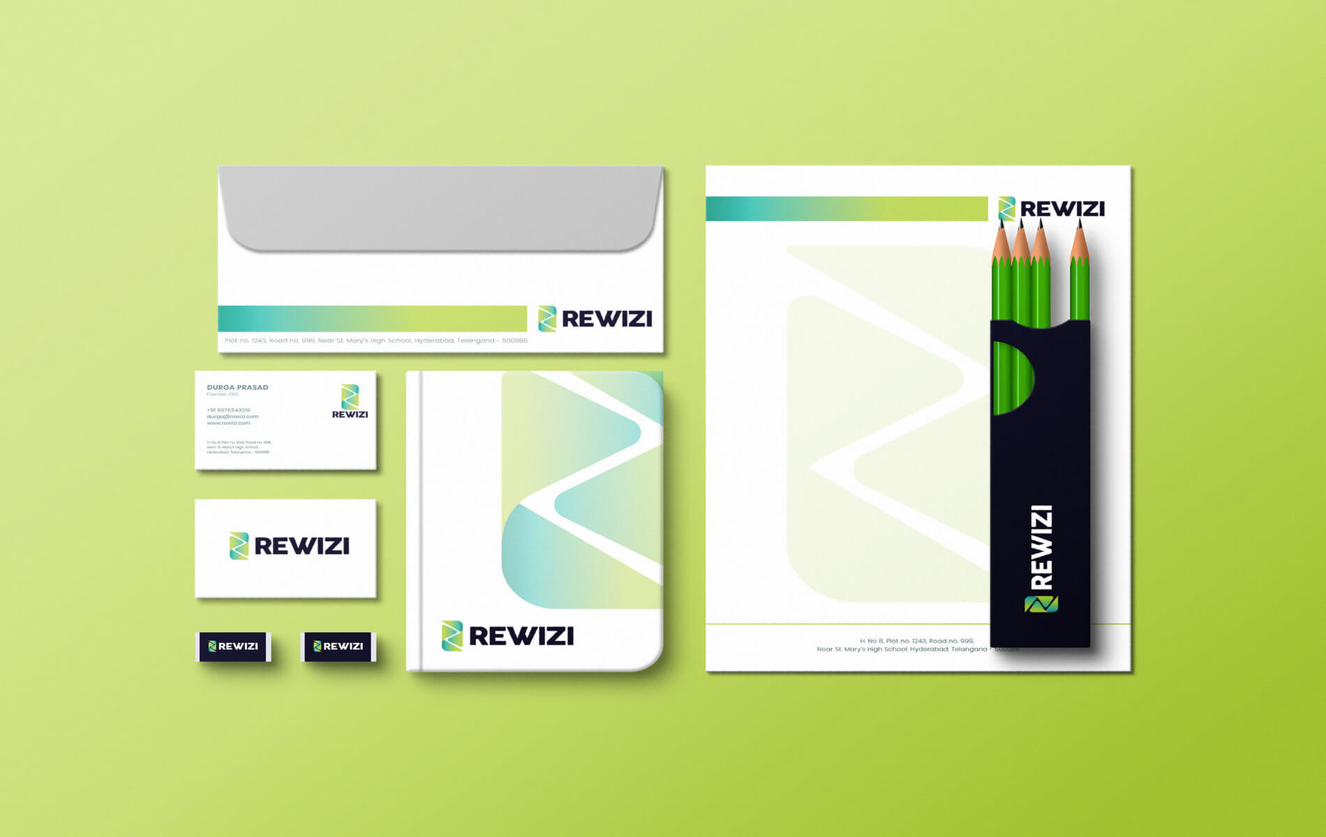
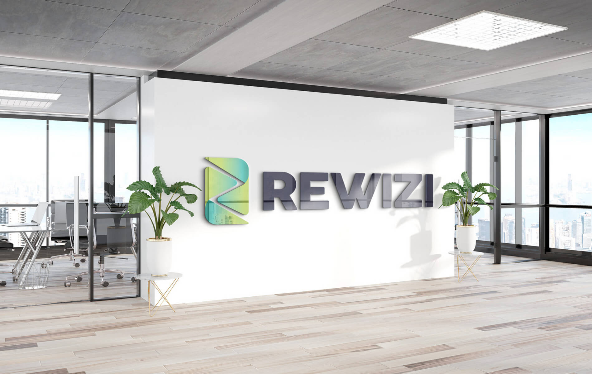
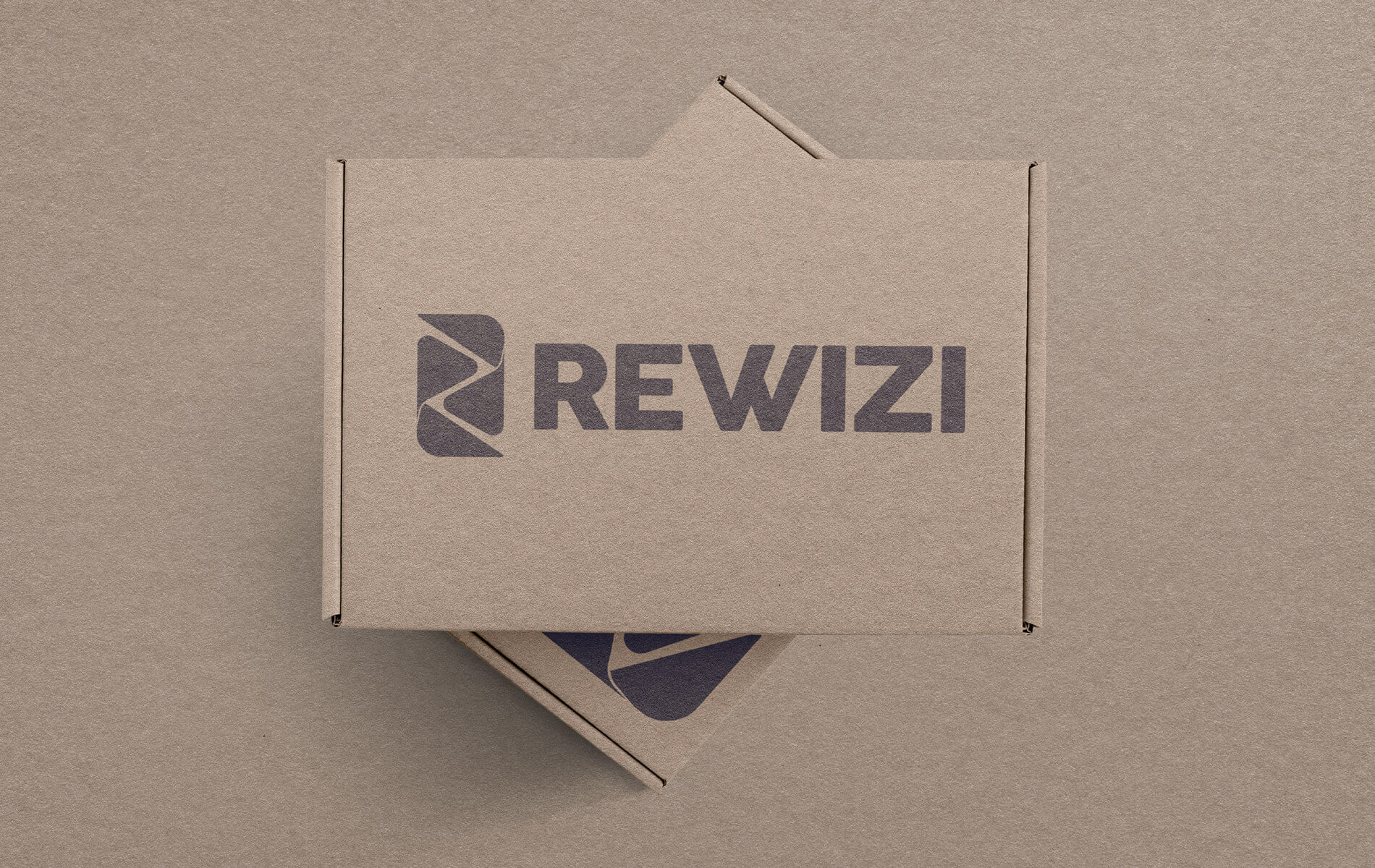
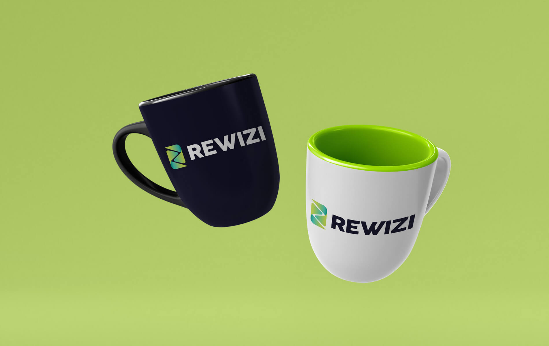
The smooth bend in the river was sharpened into the ‘R’ in Rewizi, which also resembled the ‘play’ button on an audiovisual device. The resulting triangles were treated as fractals and placed facing each other to suggest connection and communication.

The two elements in the icon seem almost fluid, and seamlessly come together to form R or Z in the negative space. The colours range from a warm yellow to a calming aquamarine in a gradient pattern. Yellow represents optimism while green suggests abundance and calm; blue creates a sense of reassurance.


The font or typeface is broad and solid, showing dependability and expertise. It’s depicted in navy blue, which reinforces the idea of authority and reliability. The logo balances movement and solidity, ease and expertise. It’s a reflection of what Rewizi brings to its customers’ everyday lives.